I made a couple of changes to my blog, mostly in the layout. I feel like I need to change the look every couple of months to keep myself engaged. It took me forever to decide on the colors, and I spent two days asking my husband which blue he likes the best. "Do you like periwinkle, honey? Do you like cobalt better, sweetie? Yes, they're both blue, but ones blue-er. Honey?"
I am most proud of the banner, which I designed myself from some digital pics I took with my old camera and my new camera. 
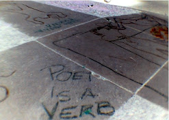
The first picture is an inverse of the poet=verb snapshot I took back in April. (Wow, time flies.) Speaking of poet=verb, I didn't post my poetic verbs this week. I'm rethinking the concept of just posting my verbs. I think I'm still going to keep track of them, but I think I'd like to transform those posts into more weekly or biweekly ruminations on poetry as an action and how it affects my writing life. Those will resume after my vacation. 
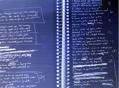
The second picture is an inverse of a closeup I took of my journal. I'm hoping to make a cover for a new journal before I leave on my trip, because this one is getting old and full. Which is a good thing. 
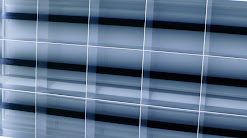
The third picture is an inverse closeup of the fluorescent lights above my cube in my office. It haunts me, with its sickly white glare.
Please let me know what you think of the redesign, so I don't have to bother my husband anymore. He thanks you in advance.
Wednesday, June 27, 2007
Instead of Verb, I Decorate
Posted by Jessica at 5:48 PM
Labels: Miscellaneous, poet=verb
Subscribe to:
Post Comments (Atom)
6 Comments:
Well, blue on blue may be a teensy bit hard to read...
I'm adding you to my blog roll...
Glad you asked! I had definitely noticed the change. And glad you gave the story on your banner. (I didn't recognize the fluorescents--you made them look good.)
I like it a lot. Fresh and vibrant. I am okay with blues on blue. It reads okay on both my home and work computers.
I also understand the shades of blue questions for your husband...by profession I'm a designer (interior--but more in to architecture than decorating) and go through those nuanced questions myself. It is not easy to decide these things.
The only think is, now I wish I had the time and ability to change mine... :-)
I really like the new lay out with the small column on the left hand side.
The banner is great.
I like this color blue whatever it is called.
Nicely done, lover!
Wow -- thanks for the responses, everyone.
Jeannine -- thanks for the feedback about the blue on blue, I'm still experimenting with the text colors. And thanks for the add to your blogroll.
deb-- I'm glad you like the pics. It was really hard to make the lights look actually good, rather than demonic.
You know, the updates weren't that hard to do. I used the Minima Lefty Stretch template, chose my own colors, and added some digital pics that I altered in "Paint" to the header. All in all, it took me 2-3 hours... most of which was spent waffling on blues.
aaron -- I have no idea what blue this is called. Umm, navy-cobalt blue? I'm glad you like. :)
PS Hmm, I forgot to mention that I'm blue/violet color blind, so the blues may be hard for me to distinguish between. I forgot that other people don't have that problem :)
I also like the banner!
Great blog! And thanks for your kind words about Becoming the Villainess a little while back!
Post a Comment